• Skip to primary navigation
  • Skip to main content
  • Skip to primary sidebar

information for practice

news, new scholarship & more from around the world


advanced search
  • gary.holden@nyu.edu
  • @ Info4Practice
  • Archive
  • About
  • Help
  • Browse Key Journals
  • RSS Feeds

Visualizing Poverty Growth In Dallas

poverty-mapFrontburner | J Palmer

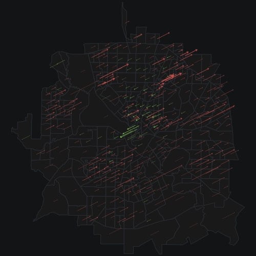
See that dark, brooding image above? That is an attempt to illustrate the increases and decreases in poverty in different neighborhoods in Dallas. The red arrows represent where poverty has increased. They are thicker where populations are denser and longer where poverty has increased more. The green arrows represent where poverty has decreased. You can see them clustered around Uptown and fanning out through the central part of North Dallas. The biggest decrease looks to be in West Dallas.

Posted in: Infographics on 09/02/2015 | Link to this post on IFP |
Share

Primary Sidebar

Categories

Category RSS Feeds

  • Calls & Consultations
  • Clinical Trials
  • Funding
  • Grey Literature
  • Guidelines Plus
  • History
  • Infographics
  • Journal Article Abstracts
  • Meta-analyses - Systematic Reviews
  • Monographs & Edited Collections
  • News
  • Open Access Journal Articles
  • Podcasts
  • Video

© 1993-2025 Dr. Gary Holden. All rights reserved.

gary.holden@nyu.edu
@Info4Practice